

The Brands
Featured Branding Case Studies

Mad Mutz
A crazy brand, ecommerce site, and packaging design for our longtime client Mike Hauke's most recent flavor adventure.
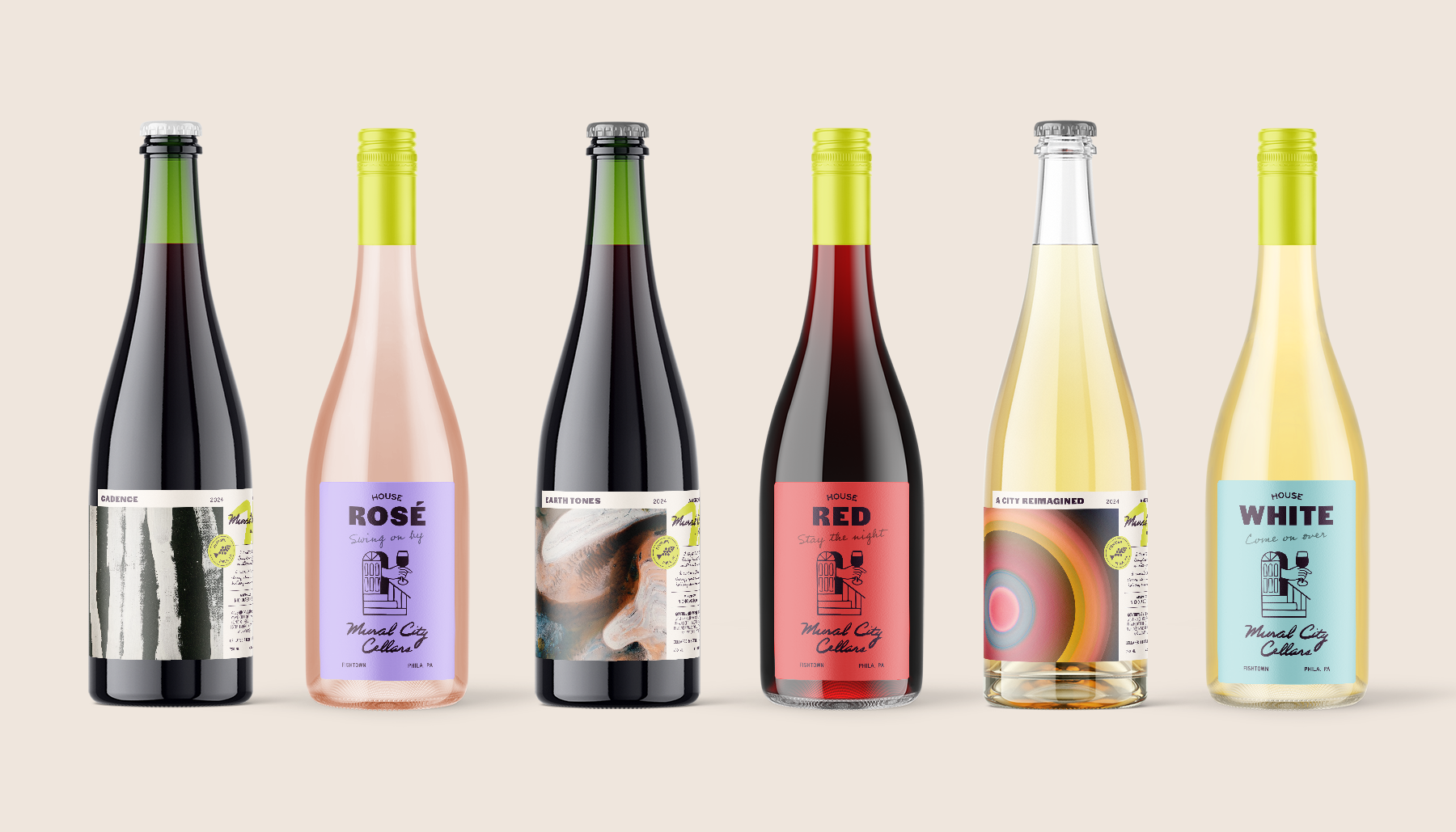
Mural City Cellars
Philadelphia's first and favorite urban winery.

Fresh Artists
Revitalizing this nonprofit’s brand and digital experience to elevate student art and education.

Roomie
Interactive 3D models created to help new students and tenants shop, move, and collaborate with confidence.

All Branding Case Studies

Springshot
Rebrand and web design to support mobile teams and elevate employee morale

Swish
Elevate your everyday with spa-like baths created on time and in budget.

Ameco
Identity refresh and web presence for an experienced California solar and roofing specialist.

Little Owl Chalet
A cozy brand for a vintage Poconos escape.

Studio Solow
An upscale brand identity for a downshore design studio.

North Folk Social & Cidery
Canadian folklore inspired beverages made for Legendary Good Times.

Mino for the Bronx
Establishing a campaign identity and social strategy for an aspiring NYC Councilwoman.

Tailqr
Non-Binary Neckties for Every Body

Snap Labs
Empowering this cybersecurity startup with sleek branding and product design.

Standing Wave Coffee
Branding and packaging for a southwestern PA coffee roaster.

Maquina Coffee Roasters
Stand out packaging and branding for an internationally recognized coffee roaster.

Groundswell Guild
Crafting a seasonal brand and website for the modern-day homemaker.

Groundswell Design Group
A colorful and minimal brand for a placemaking and interior design studio.

Pennsylvania Patch Coalition
Raising awareness for Pennsylvania State Parks with viral patch designs and kickstarter campaign.

Little City Montessori
Designing a brand identity for a Montessori community.

Harmonic
A new model for helping Americans build financial resilience.

CSIRO
Badge design and branding for an Australian scientific research agency.

NASA
Branded patch design for the team taking humans safely to space

Poconoland Rentals
Memorable Mountain Retreats and Fun Family Stays in the Poconos
Oldies but Goodies
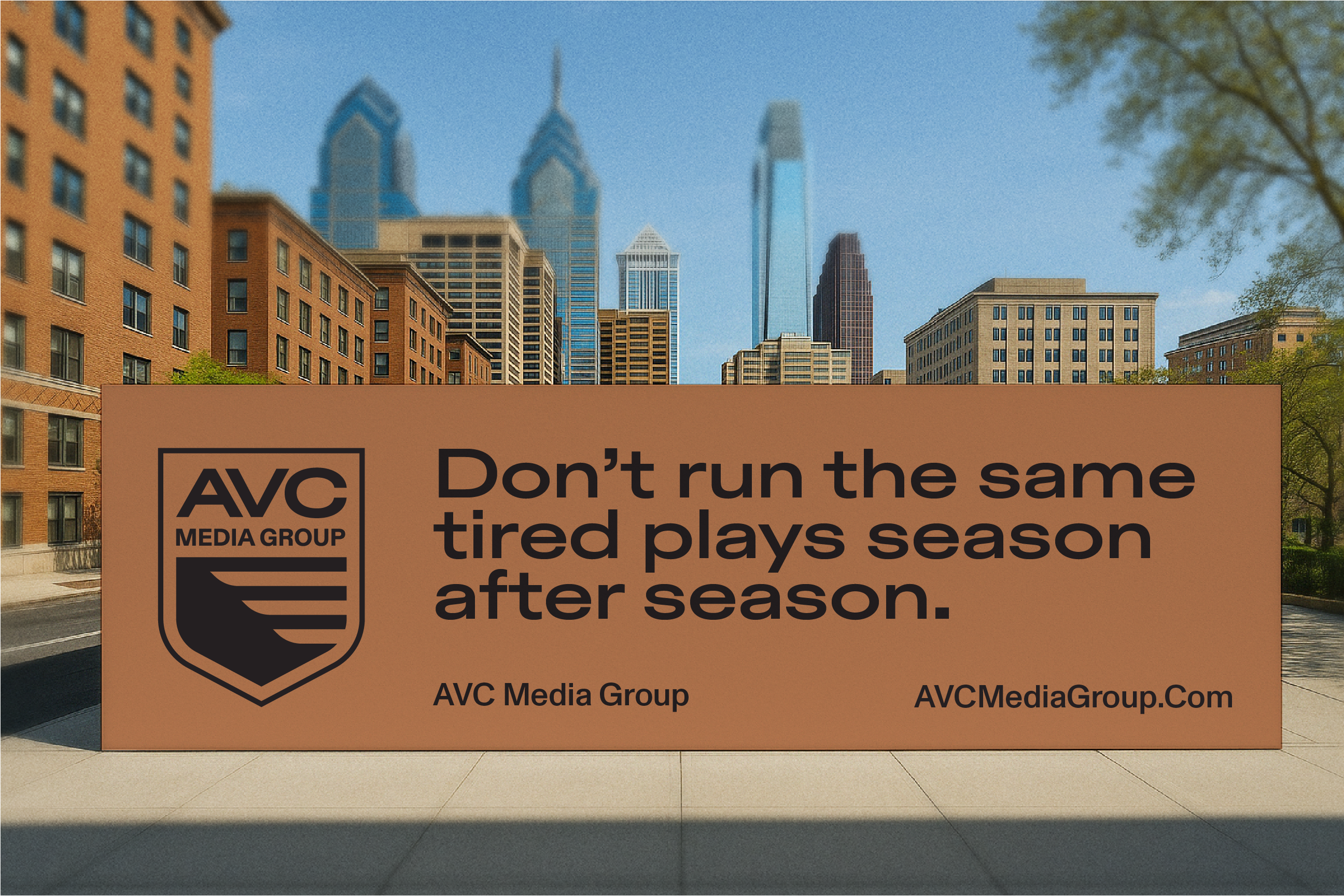
AVC Media Group
A family ad buying agency making cutting edge plays for businesses large and small.

Penguin Random House
A thirty title series of cover designs reimagining Stephen King's most popular works.

Snowdrift Coffee
A snowy, small town coffee company offering educational roasting classes.

Tony Boloney's
An appropriately irreverent brand identity for the world's most brazen pizza shop.

H&A Security
Building an online presence for the next generation of cyber guardians.

Mado
Playful video chat application that promotes whimsical interactions between kids and their loved ones.
The Rise

Kinder & Kradle
A woodland fairytale brand for nursery cleaner products and other non-chemical home goods.

Cro Metrics
Finding identity for a team dedicated to iteration and experimentation.
A Philadelphia Branding Studio
Let's get to know each other better...
Let's get to
know each

other better...


